monagtc

How to Make Perfect UI Designs

UI, or user interface, design is all about how a product’s interface looks and feels. It’s the first thing users see when they open an app or visit a website, so it’s important to make a good impression. A well-designed UI can make the difference between a user staying on your site or moving on to someone else’s. So, how can you create the perfect UI? There are a few key elements to keep in mind when designing your UI! Let’s take a closer look at each one. Target Audience The first step is to think about your target audience. Who will be using your site or app? What age range do you want to target? What are their needs and wants? What kind of experience do you want them to have? Keep these things in mind as you design your UI so that you can create something that will appeal to your target users. Keep It Simple A cluttered, confusing UI will only frustrate users and cause them to leave. If the users cannot figure out an overcomplicated design, they are not going to stick by. Keep your design clean and easy to navigate so that users can find what they’re looking for without any trouble. Your users should be able to understand what they need to do without any confusion. This means using familiar icons and layouts that are easy to navigate. It also means getting rid of any unnecessary steps or clutter that might get in the way. The goal is to make your interface as intuitive and straightforward as possible. Minimalist designs are the way to go when you are creating UI. Make It Visually Appealing Aesthetics are important in a UI. If it looks good, users will be more likely to enjoy using it. Use colors, fonts, and other design elements judiciously to create a pleasing visual experience for users. Again, minimalism is your best friend! So keep that design crisp, clean and easy to navigate and understand. make_it_visually_appealing Consistency Once you’ve created a simple interface, it’s important to maintain that same level of consistency throughout the entire user experience. This means using similar colors, fonts, and layouts throughout your product. It also means being consistent with the language you use to describe actions or features. Users should be able to move from one part of your product to another without feeling disoriented or lost. Make It Intuitive A good UI should be intuitive, meaning users should be able to figure out how to use it without needing instructions. Intuitive design is achieved through a thoughtful layout of the elements on the screen as well as clear and concise labeling. When laying out the elements on your screen, ask yourself how a user would expect them to be arranged. For example, most people would expect to find the search bar at the top of the screen rather than the bottom. Grouping similar items together (such as all social media icons in one area) can also help with intuitiveness. Make It Intuitive Use Visual Cues In addition to keeping things simple and intuitive, using visual cues can also help guide users through your product. For example, you can use color coding to indicate different types of information (such as red for error messages and green for success messages). You can also use arrows or other visuals to direct a user’s attention to a specific area on the screen. Use Visual Cues Test, Test, Test! After your product is launched, it’s important to continue testing its UI with actual users. Try conducting usability tests where you observe users as they try to complete specific tasks using your product. This will help you identify areas where your product could be improved from a usability standpoint. You can also track analytics such as click-through rates and time on site/page to get an idea of how well users are interacting with your product overall.

UI, or user interface, design is all about how a product’s interface looks and feels. It’s the first thing users see when they open an app or visit a website, so it’s important to make a good impression. A well-designed UI can make the difference between a user staying on your site or moving on to someone else’s.

So, how can you create the perfect UI?  There are a few key elements to keep in mind when designing your UI! Let’s take a closer look at each one.

Target Audience

The first step is to think about your target audience. Who will be using your site or app? What age range do you want to target? What are their needs and wants? What kind of experience do you want them to have? Keep these things in mind as you design your UI so that you can create something that will appeal to your target users.

Keep It Simple

A cluttered, confusing UI will only frustrate users and cause them to leave. If the users cannot figure out an overcomplicated design, they are not going to stick by. Keep your design clean and easy to navigate so that users can find what they’re looking for without any trouble. Your users should be able to understand what they need to do without any confusion. This means using familiar icons and layouts that are easy to navigate. It also means getting rid of any unnecessary steps or clutter that might get in the way. The goal is to make your interface as intuitive and straightforward as possible. Minimalist designs are the way to go when you are creating UI.

Make It Visually Appealing

Aesthetics are important in a UI. If it looks good, users will be more likely to enjoy using it. Use colors, fonts, and other design elements judiciously to create a pleasing visual experience for users. Again, minimalism is your best friend! So keep that design crisp, clean and easy to navigate and understand.
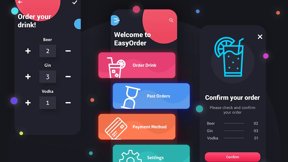
make_it_visually_appealing

Consistency

Once you’ve created a simple interface, it’s important to maintain that same level of consistency throughout the entire user experience. This means using similar colors, fonts, and layouts throughout your product. It also means being consistent with the language you use to describe actions or features. Users should be able to move from one part of your product to another without feeling disoriented or lost.

Make It Intuitive

A good UI should be intuitive, meaning users should be able to figure out how to use it without needing instructions. Intuitive design is achieved through a thoughtful layout of the elements on the screen as well as clear and concise labeling.

When laying out the elements on your screen, ask yourself how a user would expect them to be arranged. For example, most people would expect to find the search bar at the top of the screen rather than the bottom. Grouping similar items together (such as all social media icons in one area) can also help with intuitiveness.

Make It Intuitive

Use Visual Cues

In addition to keeping things simple and intuitive, using visual cues can also help guide users through your product. For example, you can use color coding to indicate different types of information (such as red for error messages and green for success messages). You can also use arrows or other visuals to direct a user’s attention to a specific area on the screen.
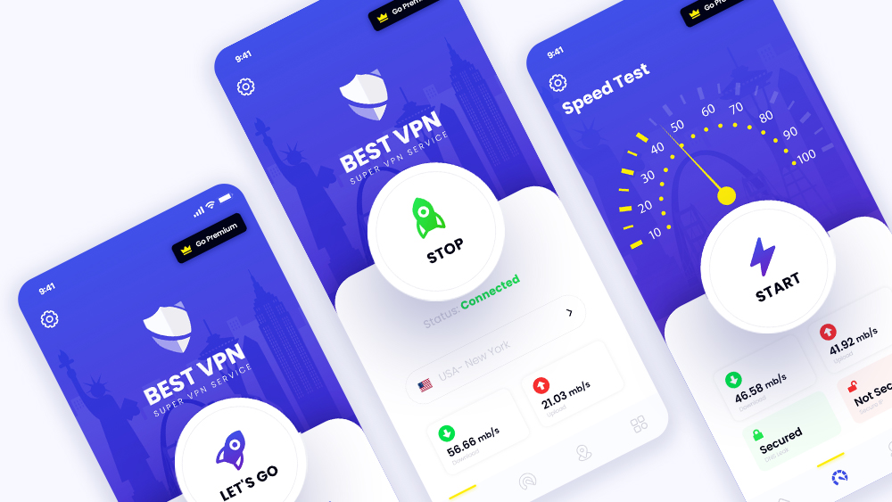
Use Visual Cues

Test, Test, Test!

After your product is launched, it’s important to continue testing its UI with actual users. Try conducting usability tests where you observe users as they try to complete specific tasks using your product. This will help you identify areas where your product could be improved from a usability standpoint. You can also track analytics such as click-through rates and time on site/page to get an idea of how well users are interacting with your product overall.